Overview
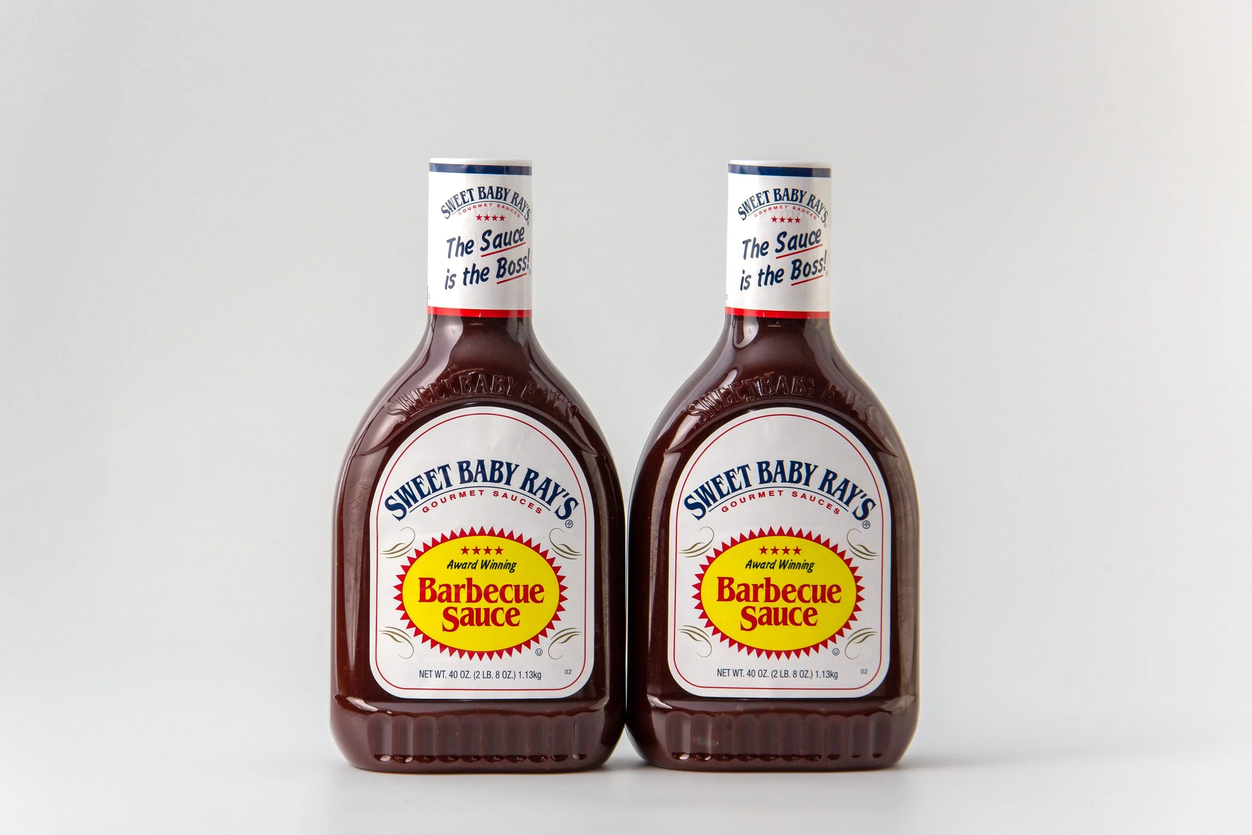
Sweet Baby Ray’s is a well-known BBQ sauce with mass-market appeal, but its visual identity leans heavily commercial.
For this project, I set out to reimagine the brand with a more handcrafted, backyard-inspired personality — one that feels bold, premium, and authentic.
Strategy
The redesign focused on:
Shifting the brand from commercial to craft
Building a visual system that evokes backyard cooking culture
Developing a cohesive identity that works across bottles, labels, and gift packaging
Modernizing the look while retaining the spirit of the original brand
The goal was to position Sweet Baby Ray’s as a premium sauce with roots in real barbeque culture.
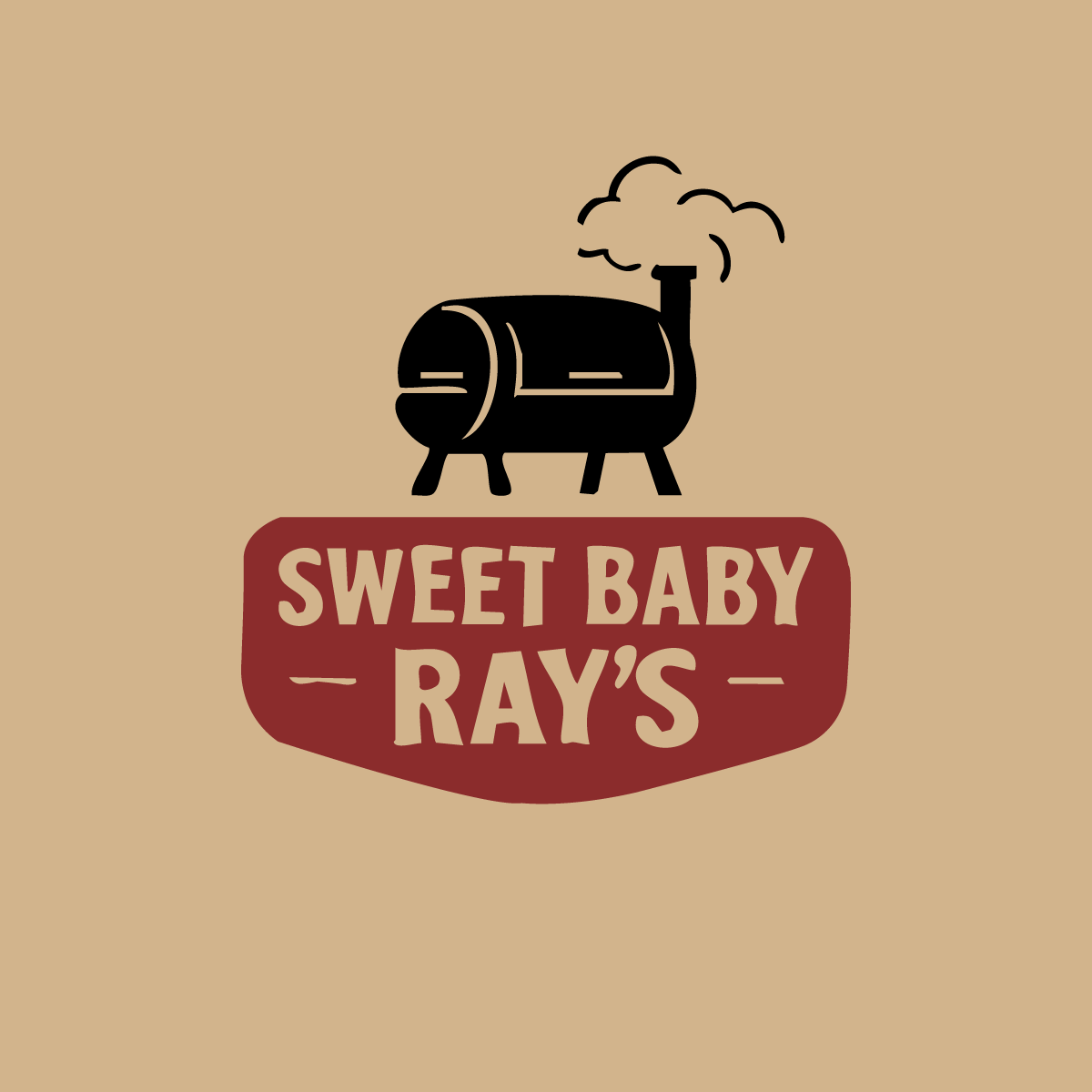
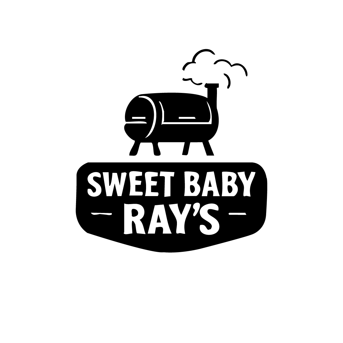
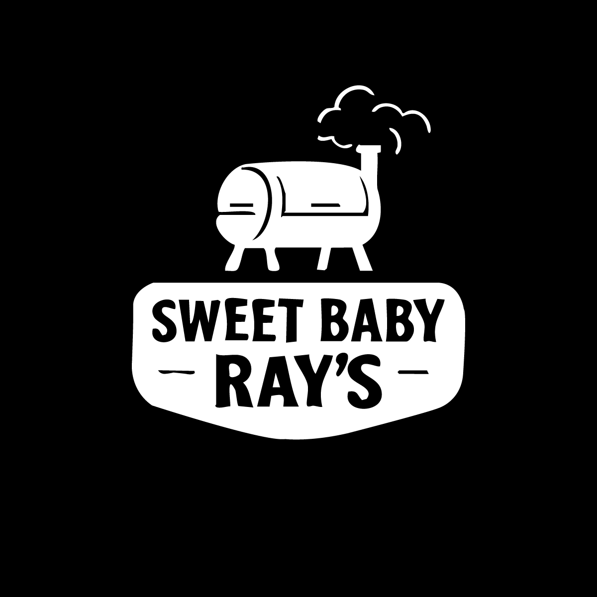
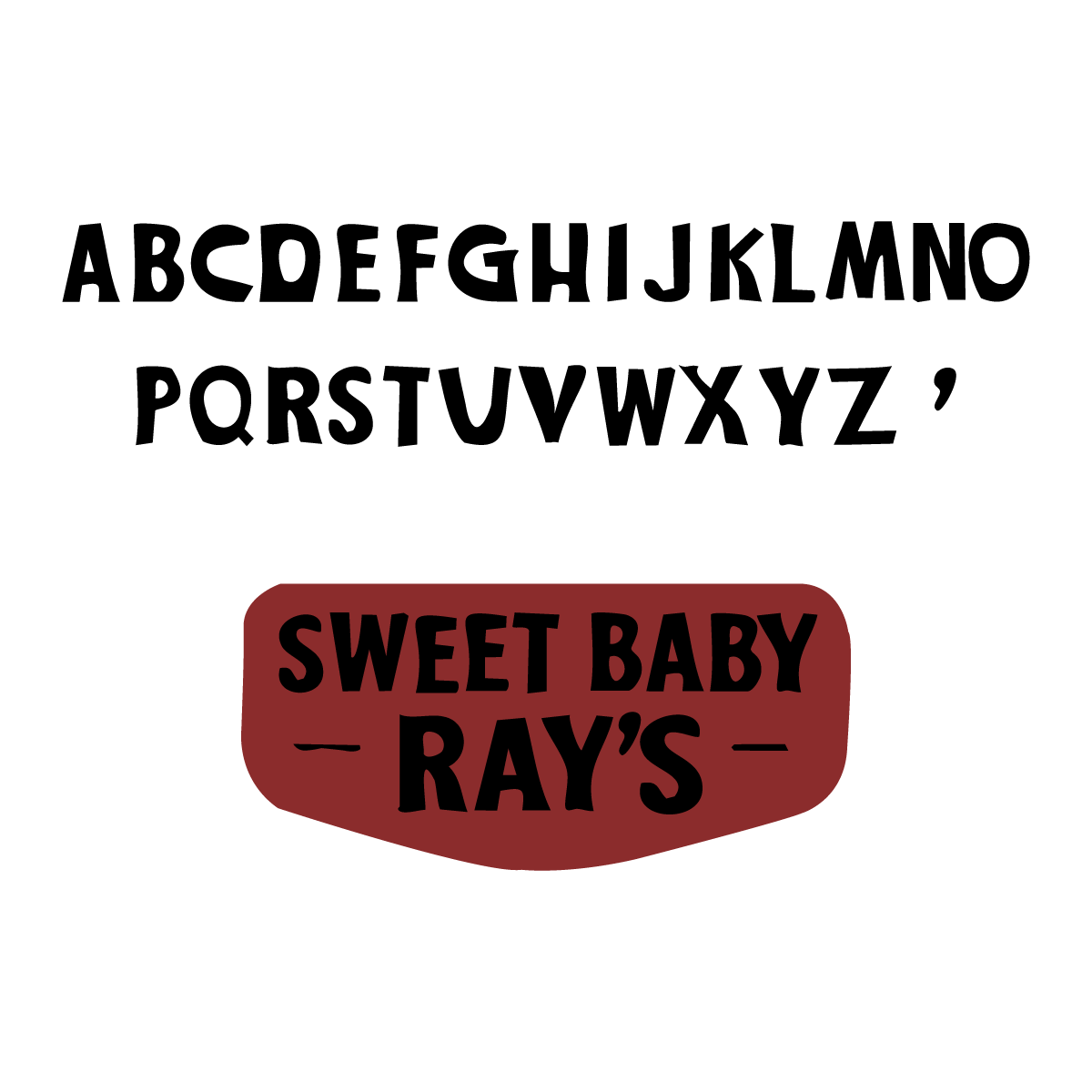
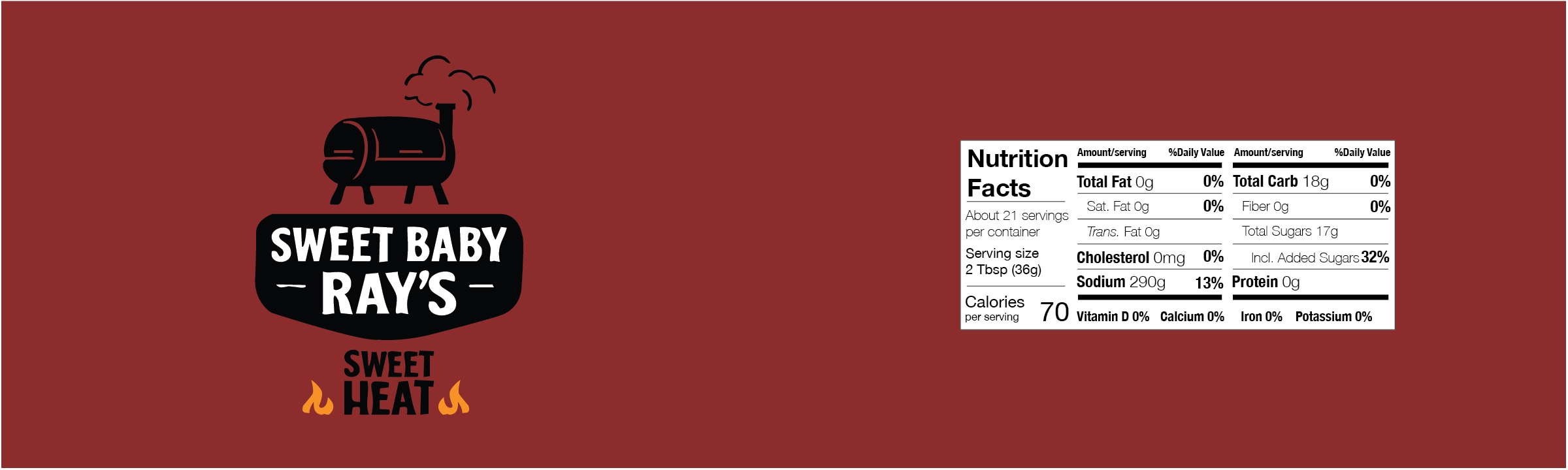
Logo Redesign
I created a custom mark inspired by the original Sweet Baby Ray’s letterforms, refining the curves, weight, and structure for a more intentional, premium feel.
The new logo becomes the foundation for the entire packaging system.
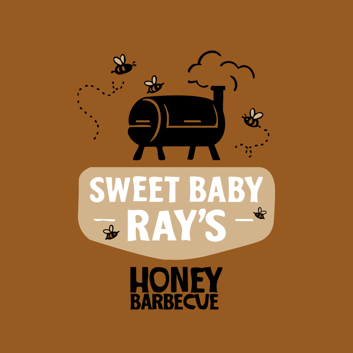
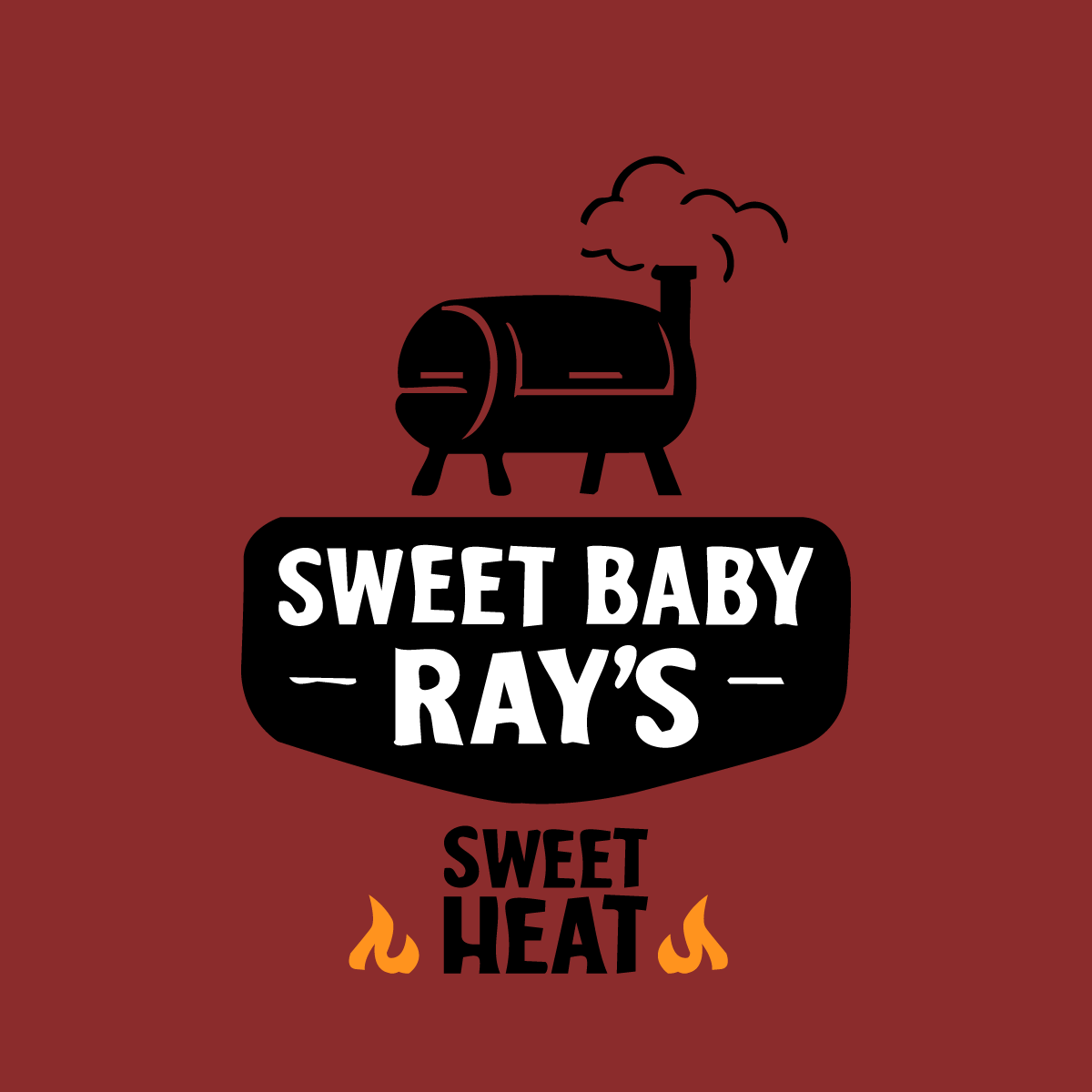
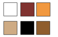
Color and typography
The brand palette is earthy and handcrafted:
Tan for natural, craft cues
Black for boldness and readability
Red-orange for BBQ heat + flavor association
I expanded the custom letterforms into a full functional A–Z type system used across the labels and packaging.
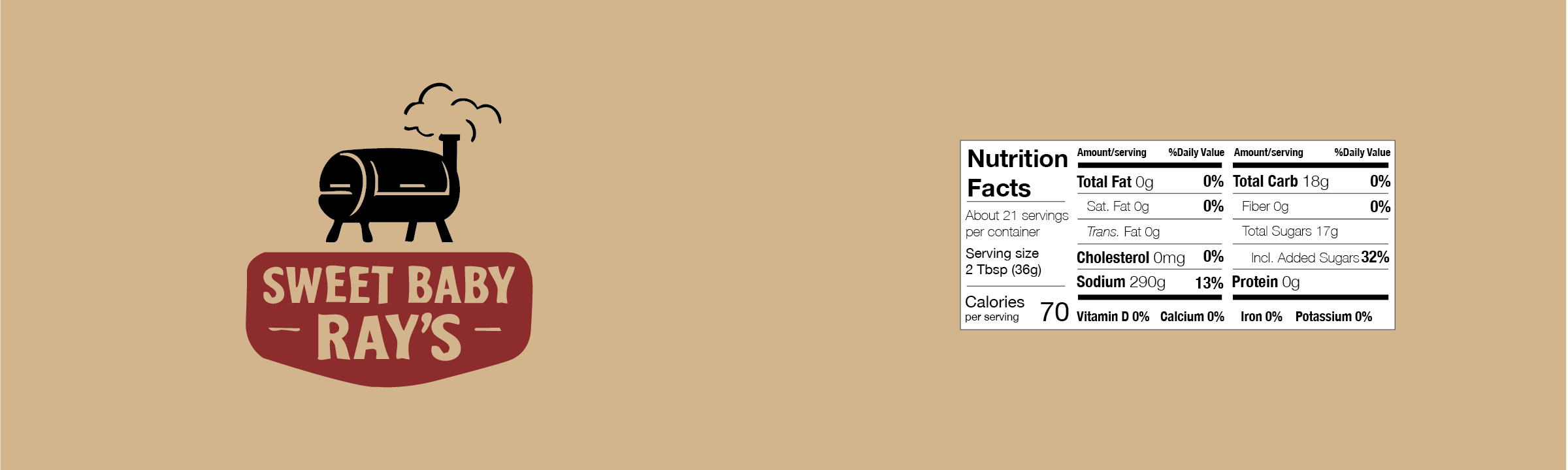
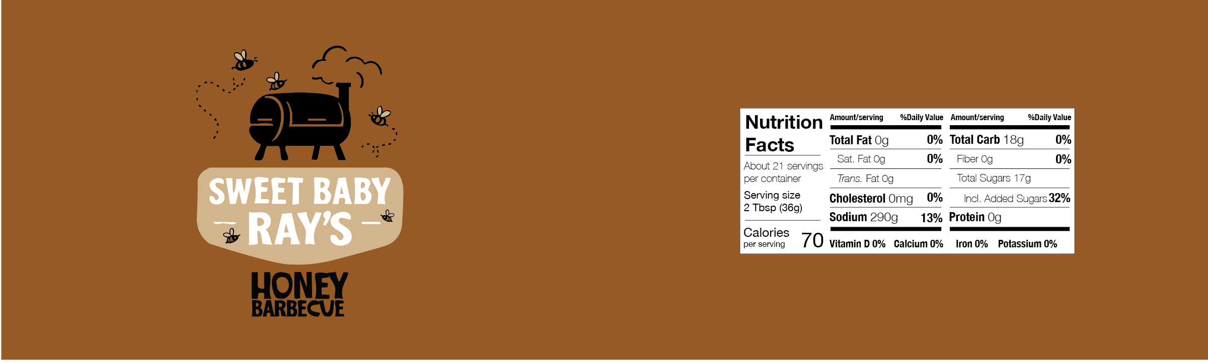
Label system
The updated labels use a strong hierarchy, simplified shapes, and a cleaner layout that balances:
Flavor identification
Brand presence
Craft personality
This system keeps the iconic feel but introduces consistency and polish across the line.
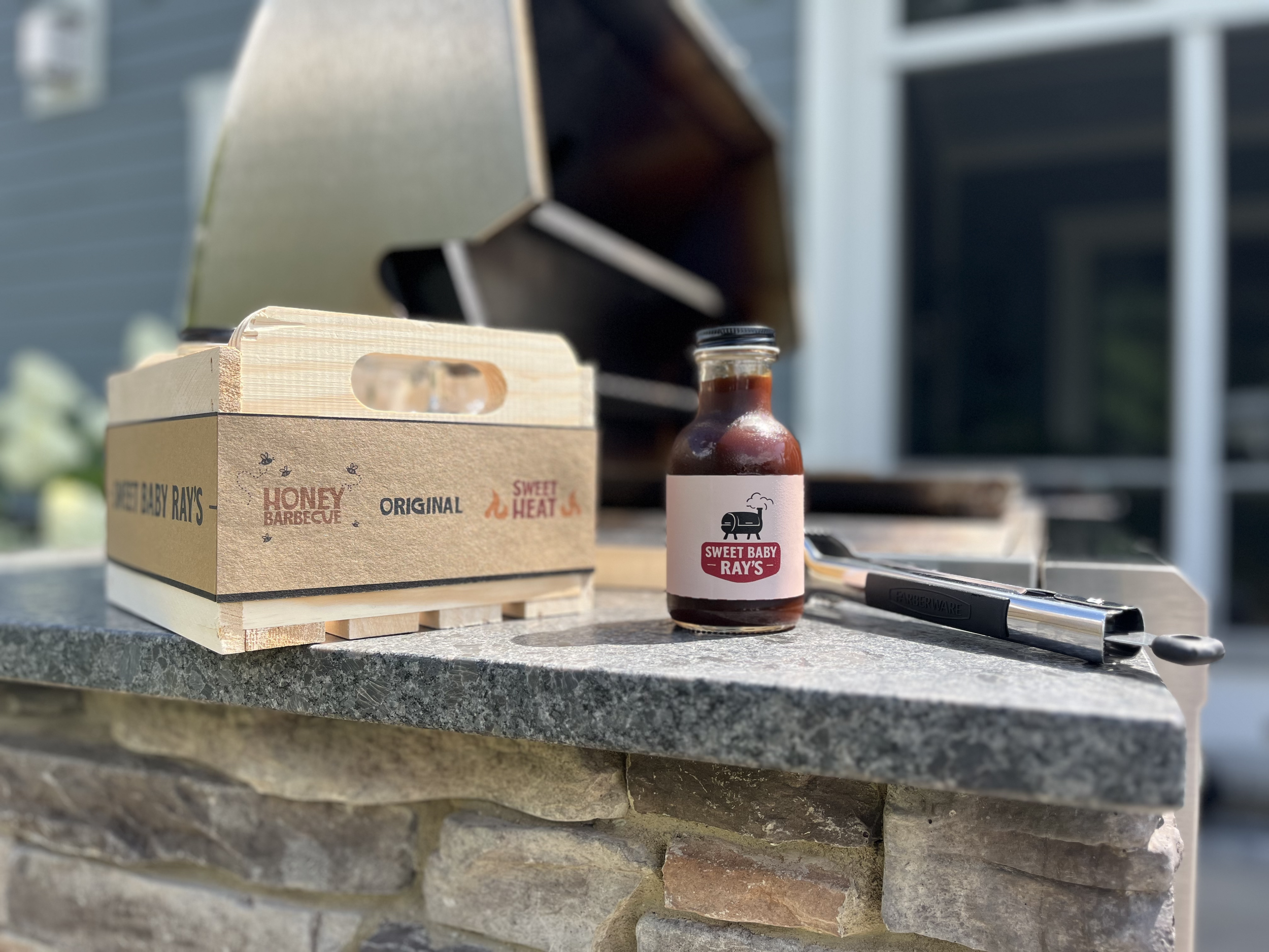
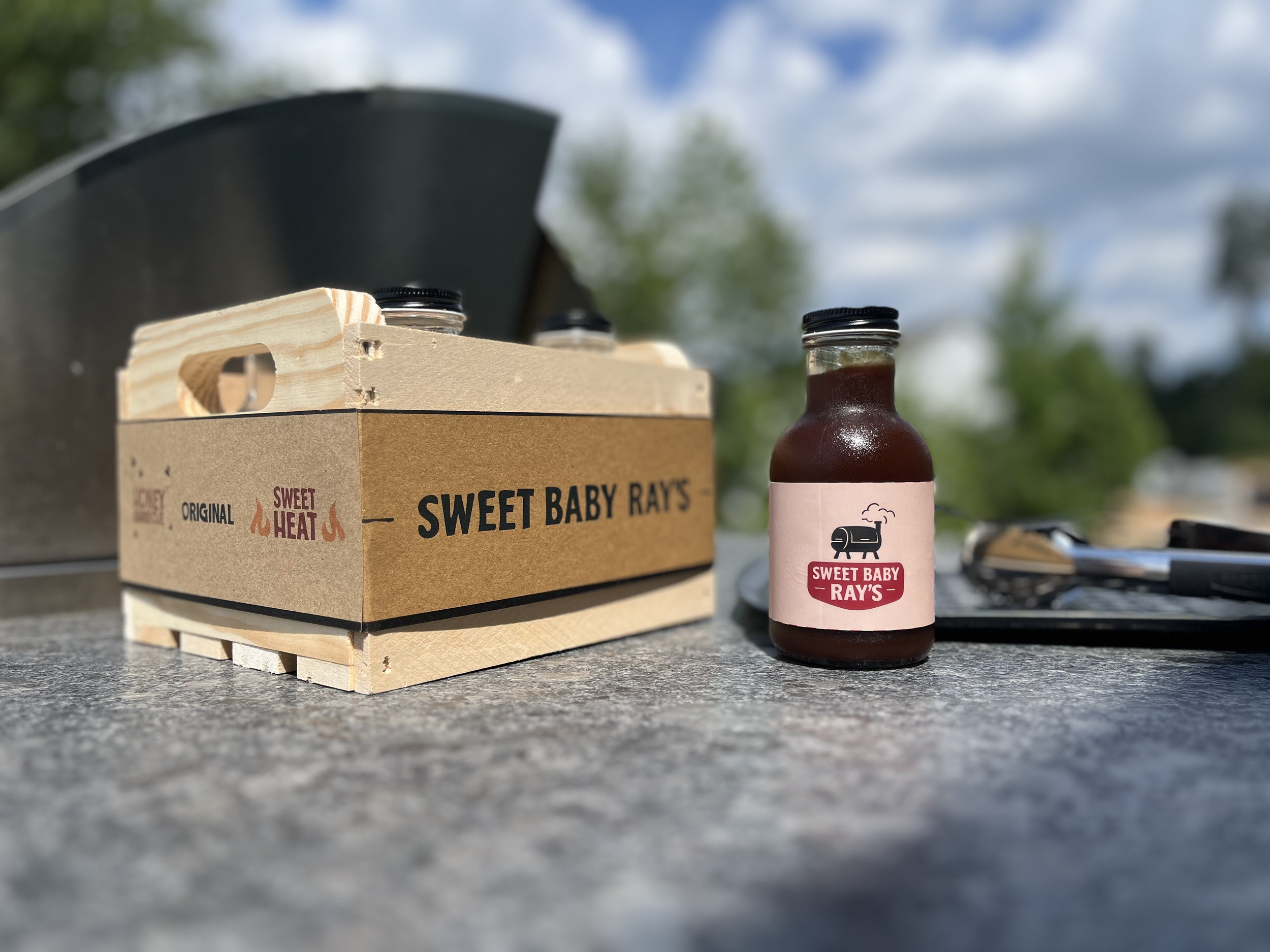
final product packaging
The redesigned bottles showcase the full visual system working together — color, type, and brand mark.
The result is a cleaner, more premium presentation that still feels familiar to existing customers.

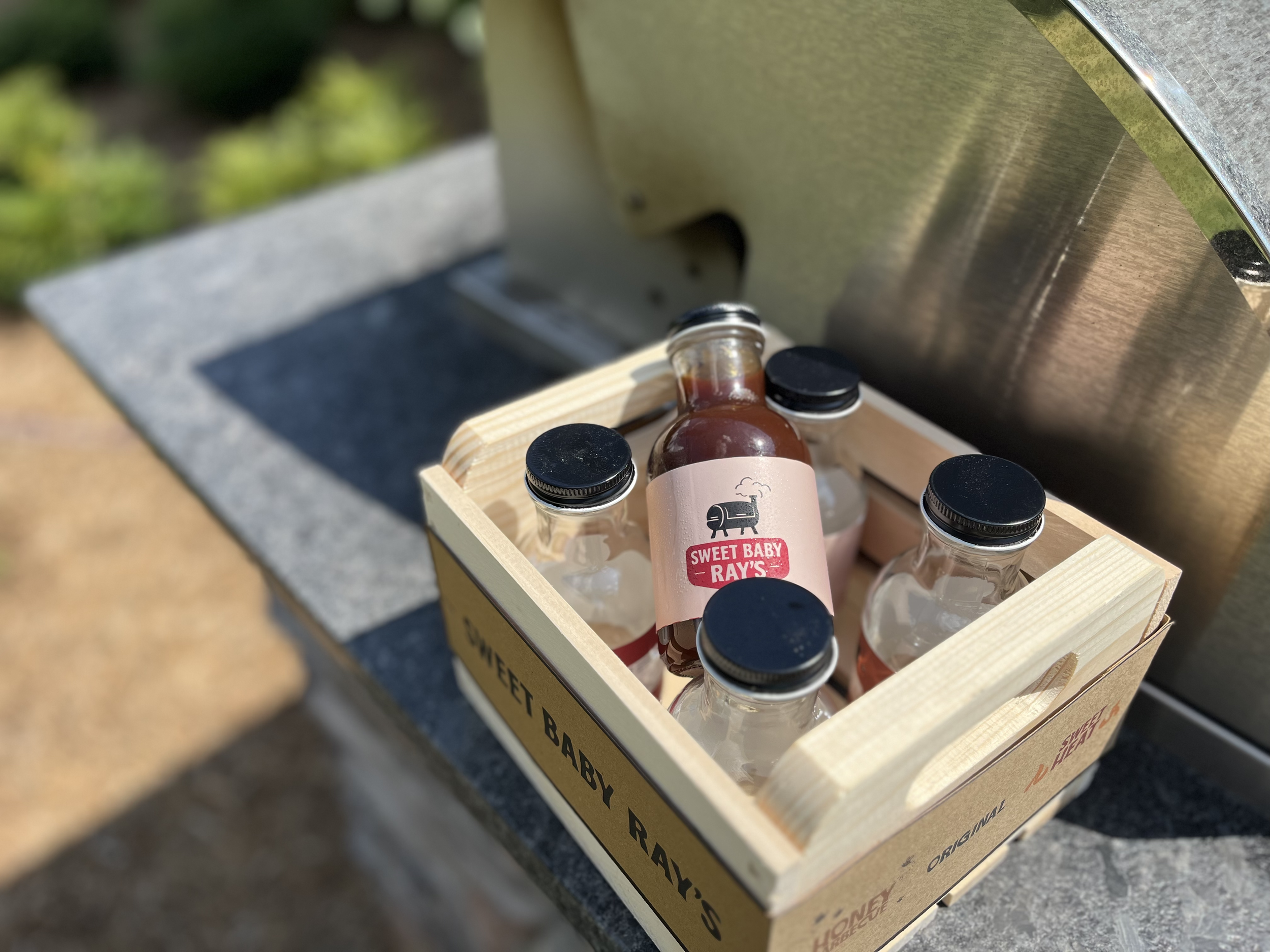
gift packaging
To extend the brand beyond the shelf, I created a gift-ready packaging system designed for sets, seasonal promotions, or retail bundles.
This highlights the brand’s versatility and positions Sweet Baby Ray’s as an ideal product for gifting and specialty retail.